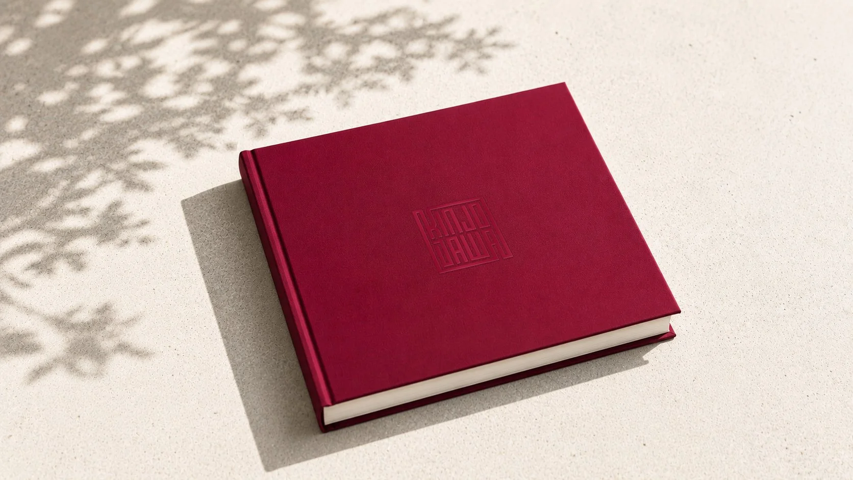
KND Fotos — Brand Identity
The Challenge
KND Fotos needed an identity that felt distinctive, sophisticated, and versatile. Founded by photographers Kinjo and Dawa, the brand wanted to connect with its initial South Asian audience while maintaining a minimal visual language that could appeal to a broader clientele.
My Role
Brand Identity, Logo Refinement, Art Direction, Color Palette, Visual Design
The Logo
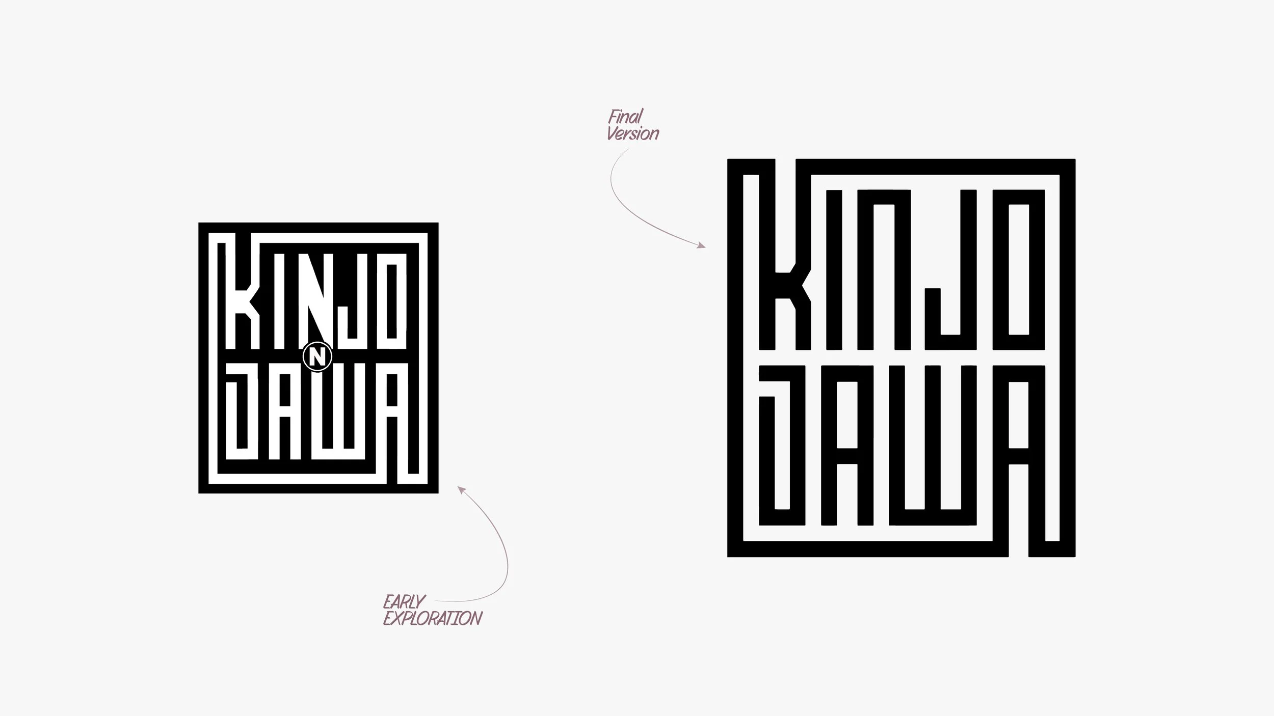
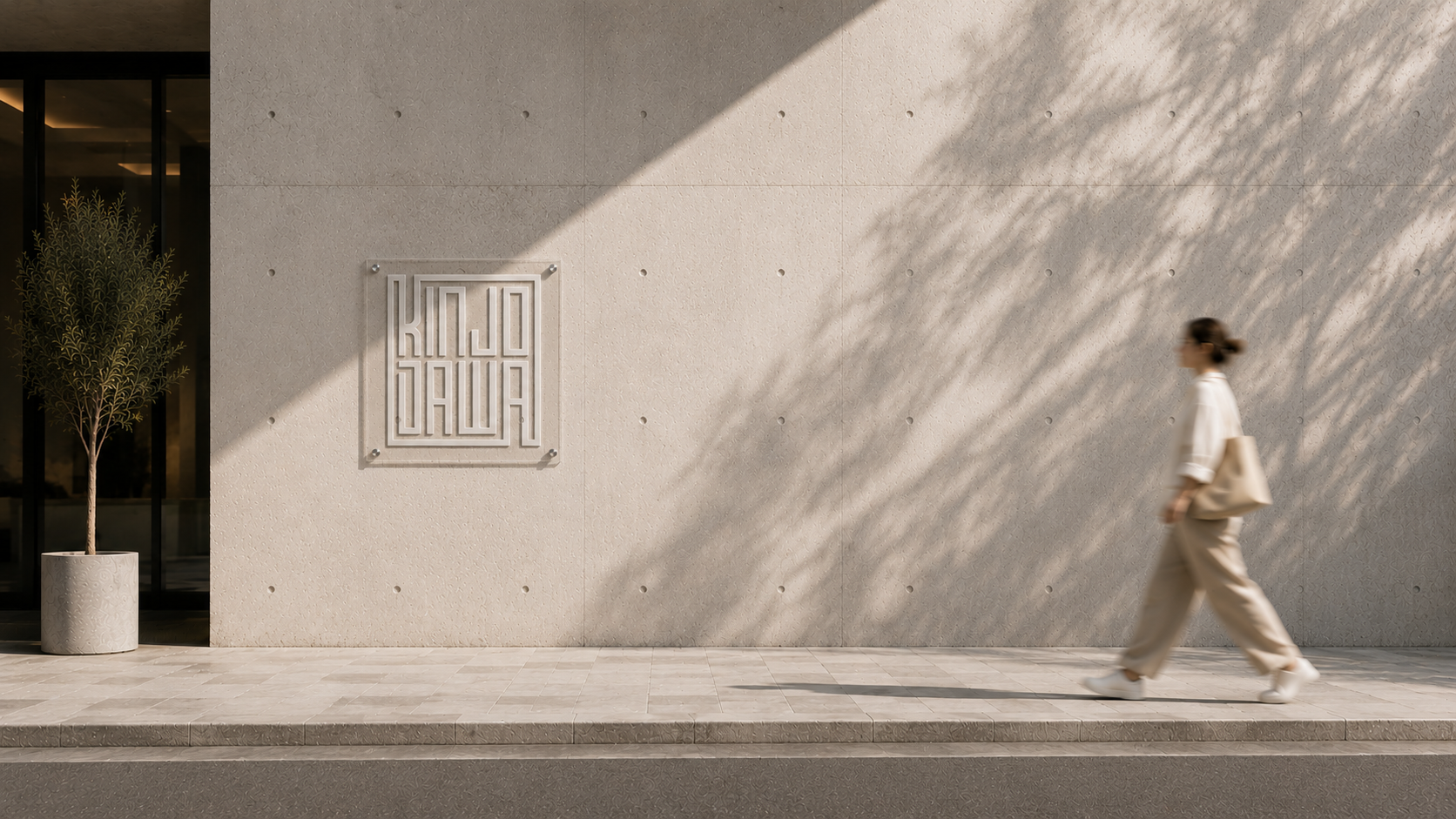
The founders came in with an initial sketch combining their names, Kinjo and Dawa. I refined the concept with consistent line weights, spacing, and proportions, creating a clean geometric mark that works as both a wordmark and a standalone icon.
The Color Palette
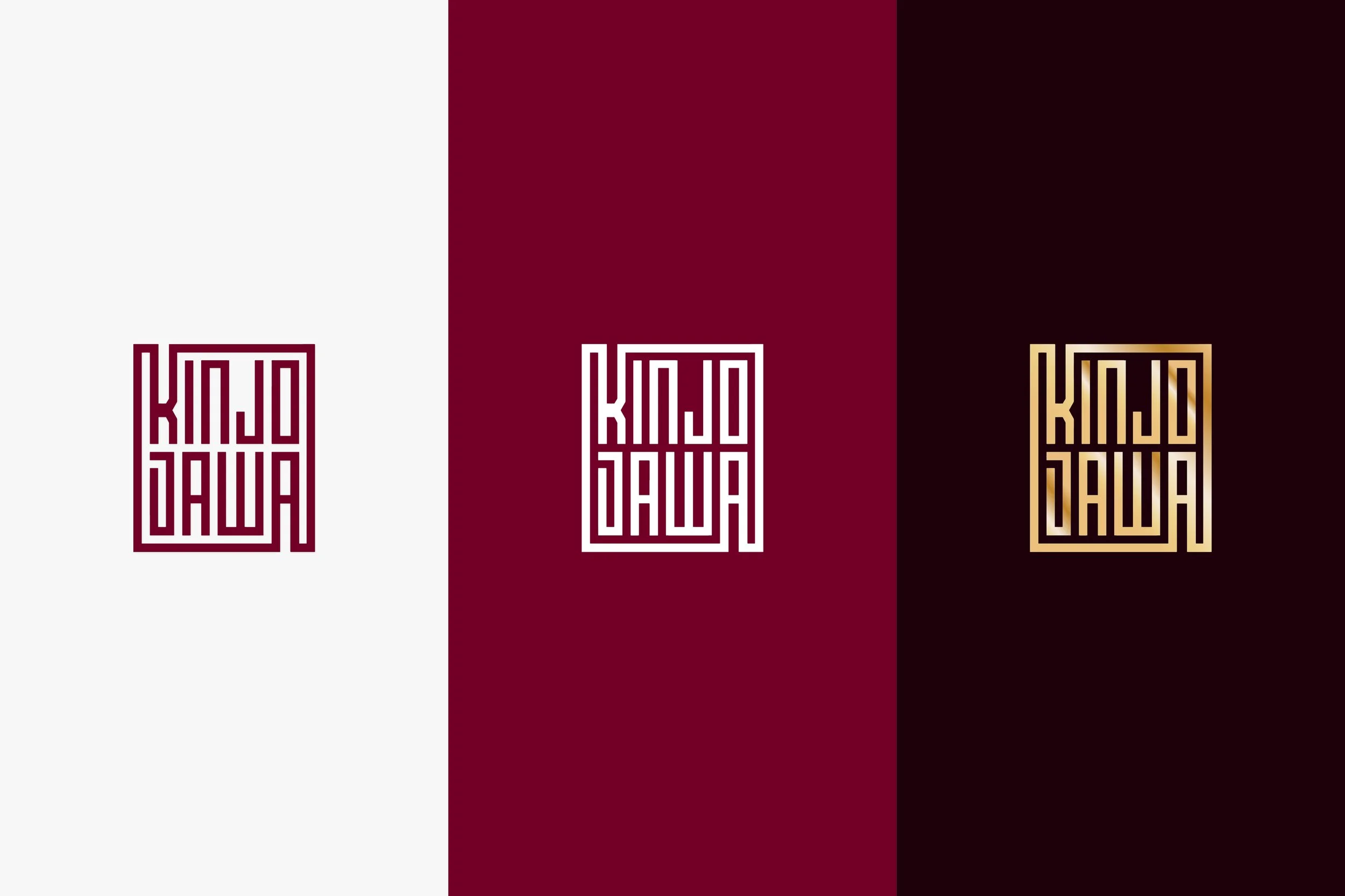
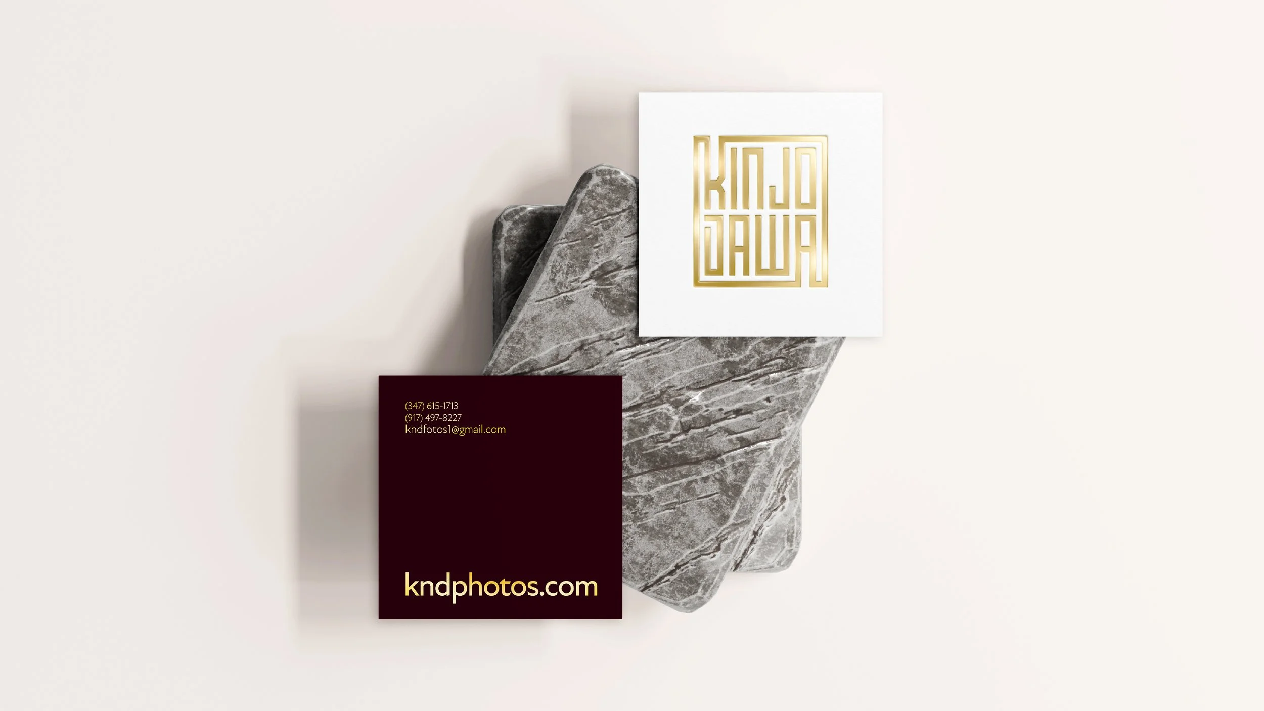
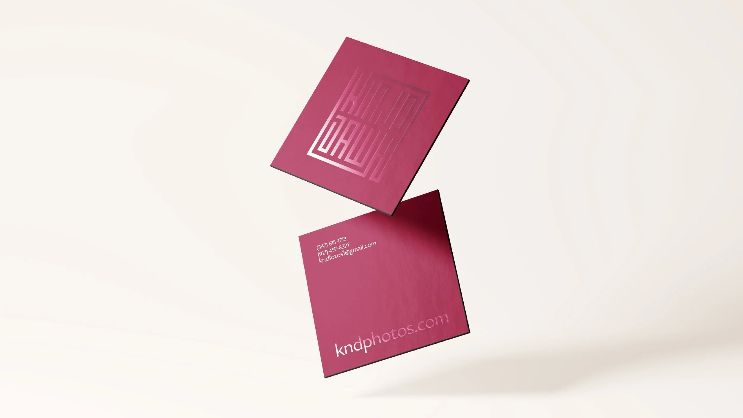
Deep maroon and burgundy bring warmth and sophistication, while gold adds a refined accent. The palette connects with KND Fotos’ South Asian audience while keeping the overall identity minimal and contemporary.